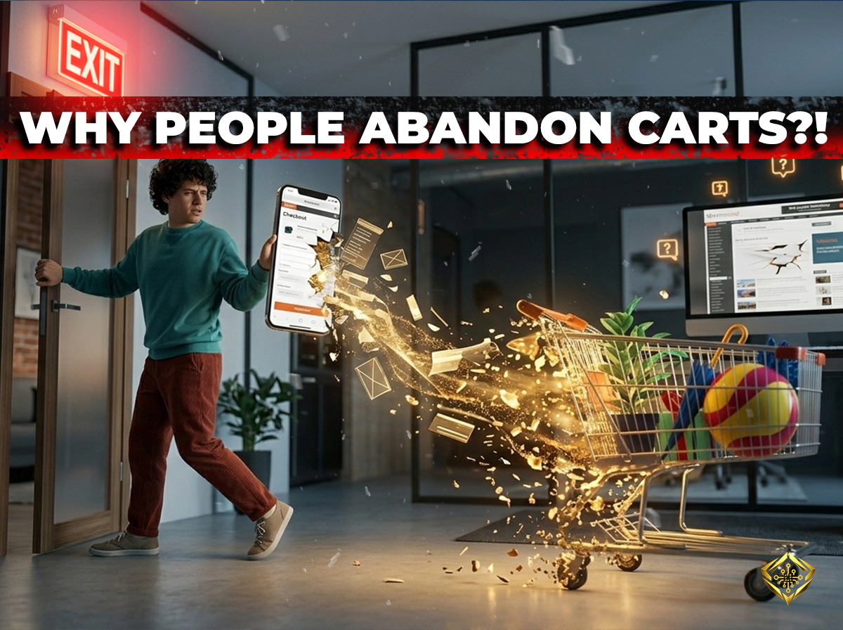
Imagine managing a physical retail storefront. A customer walks in, spends twenty minutes browsing your aisles, and carefully selects three or four premium items. They walk all the way up to the cash register, set their basket down on the counter, look at you for a split second, turn around, and walk out the door empty - handed.
In the physical world, that scenario sounds incredibly bizarre. In the digital world, however, it is the devastating baseline standard. Recent global e - commerce data shows that nearly 70% of all online shopping carts are abandoned before the checkout process is fully completed.
“ Shopping cart abandonment isn't a sign that people don't want your products; it's a sign that your checkout user experience is creating a wall of friction at the exact moment of decision. ”
Every single digital cart left behind represents a genuine lead that was primed to spend money with your brand, only to change their mind at the final hurdle. Let’s look at the primary structural reasons why modern shoppers abandon online checkout systems explained without technical jargon - along with the actionable design fixes to win those sales back.
1. The " Hidden Sticker Shock " Trap ( Unexpected Extra Costs )
The number one reason digital buyers abandon a purchase is the sudden appearance of unexpected fees at the final stage of checkout. When a consumer sees a product listed for fifty euros, clicks through three pages of shipping forms, and suddenly finds mandatory handling fees, service charges, or high shipping rates added to the final total, they feel instantly misled.
This structural surprise triggers immediate buyer's remorse and breaks consumer trust. Modern web users demand absolute financial transparency from digital storefronts before they invest their time in a multi - step transaction process.
- Upfront Transparency: Display estimated shipping fees, delivery windows, and taxes directly on the initial product or basket overview page.
- The Power of Bundling: If possible, incorporate baseline shipping costs directly into your core product pricing model to offer a clean " Free Shipping " incentive at checkout.
- Eliminate Surprises: Ensure the initial price a user sees matches the exact emotional expectation they have when clicking the final payment button.
2. Forcing Account Creation ( The Digital Interrogation )
Imagine trying to buy a quick coffee and being forced to fill out a legal registration form, create a custom password with a special character, and verify an email address before the barista will hand you your cup. You would immediately walk across the street to a competitor who keeps the transaction simple.
Forcing users to create a permanent customer account before they can purchase an item is a massive conversion killer. Shoppers see this mandatory step as an unnecessary waste of time and a privacy intrusion, causing them to drop out of your funnel instantly.
Bonus: The "Save the Sale" Email Template
Don't know what to say to bring them back? Copy and paste this proven template into your automated abandoned cart sequence to start recovering lost revenue today:
Hi [Customer Name],
We noticed you left some great items in your cart. We’ve saved them for you, but inventory moves fast!
If you had any issues checking out, just reply to this email and we’ll help you sort it out.
Ready to make them yours? Click here to complete your order:
[Link to Checkout]
Best,
The [Your Brand] Team
Ready to Optimize Your Flow?
Generic checkout flows kill conversions. Elevate your e-commerce performance with custom solutions designed to reduce friction and maximize revenue.
Explore My Expertise3. Overcomplicated Checkout Flow and Technical Delays
The human attention span on a mobile touch screen is incredibly brief. If your checkout process requires your users to navigate through four separate page reloads, scroll through endless text boxes, or manually type out their billing address when it matches their shipping info perfectly, the likelihood of abandonment skyrockets.
Furthermore, if your server experiences a tiny micro - delay or a validation error clears out their credit card details because they missed a single text field, the friction becomes completely unbearable. Modern checkouts must behave like an invisible, fluid slide from intent to completion.
The Fix: Implement single - page checkout flows with prominent progress indicators. Utilize modern digital wallet integrations like Apple Pay, Google Pay, or quick - tap PayPal options. By allowing a user to authenticate a purchase securely with their face or thumbprint, you bypass the clunkiest form - filling steps entirely.
4. The Silent Security Doubt ( Lack of Trust Architecture )
When an online shopper reaches your checkout, a silent internal dialogue begins: *"Is my financial data safe here? Will this business protect my personal records?"* If your payment page lacks visible indicators of data protection, features an outdated layout structure, or redirects them to a generic - looking third - party processing page without your branding, they will hesitate and leave.
The Fix: Place explicit trust signals right where people click. Embed clean, recognized payment processor badges ( like Stripe or Visa ) directly adjacent to your primary action buttons. Ensure your structural secure socket padlocks are working flawlessly, and never let your visual branding break during the transition from cart to payment.
Final Thoughts
Recovering lost revenue from shopping cart abandonment isn't about using aggressive sales tactics; it's about practicing extreme empathy for the distracted, busy human being on the other side of the screen.
By keeping your pricing transparent from day one, offering an effortless guest checkout option, and flattening your structural forms down to the bare essentials, you transform your checkout from a frustrating digital hurdle into a beautifully clear path of absolute convenience.
Join the Discussion (0)